Colour isn’t just decoration, but a force that sets the mood, influences behaviour and shapes how a space feels. People spend so much time obsessing over furniture and layout but forget the most powerful design tool is right there on the walls.
Choose the wrong shade, and your room can feel off, either too cold, too loud or too lifeless. But get it right, and everything just clicks. That’s the difference between a house and a space that actually feels like home.
Let’s dig a little deeper into the psychology of colour.
Warm colours for energy and passion
Red raises energy and commands attention and can be perfect for dining rooms where conversation flows and appetites grow. But use it sparingly, as an entire room drenched in red can be overwhelming, aggressive even. Orange is less intense but still bold, plus it radiates warmth, creativity and sociability. It’s good for spaces where people gather, but bad for places meant for calm.
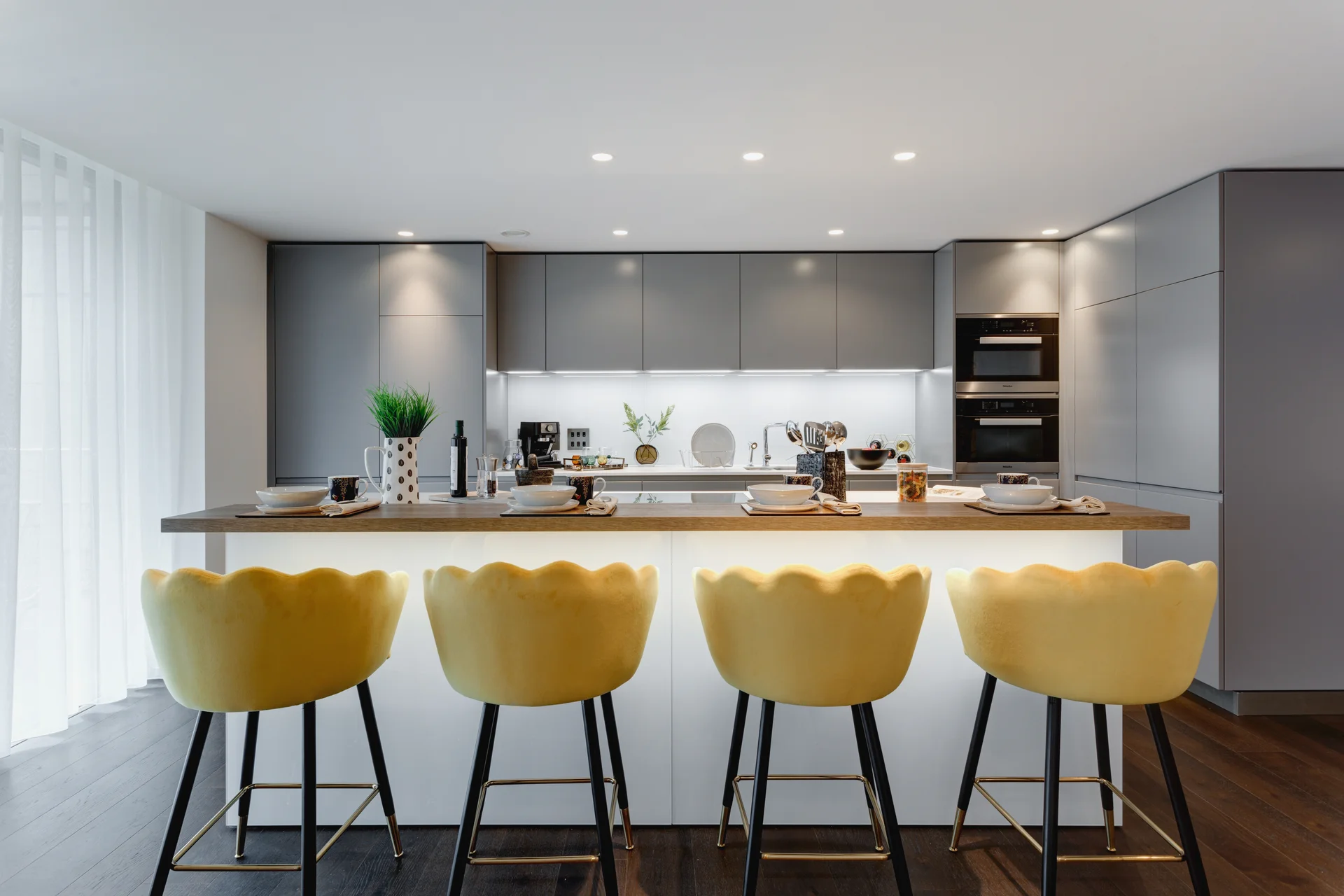
Then there’s yellow, generally considered the happy colour. It’s bright, sunny and optimistic, but pick the wrong shade and suddenly it’s too harsh or too glaring. The shade is the difference between a cheerful breakfast nook and a room that feels like it’s yelling at you.
Cool colours for calm and focus
Blue slows everything down. It’s peaceful, steady and reliable. Perfect for bedrooms and offices, and any place where you need focus or rest. Darker blues feel elegant and sophisticated, but too much can be cold and impersonal. Green is the colour of nature. It’s refreshing, stable and easy on the eyes. It pretty much works anywhere.
Deep purples feel rich and luxurious, almost regal. Lilac and lavender lean more towards relaxation. But go too far, and it will feel artificial. The trick is again finding the right shade. Just a little too cool or too warm, and the effect changes completely.
Neutral colours are safe and versatile
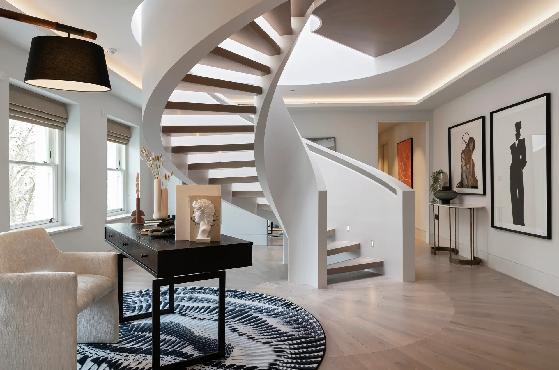
Grey, beige and white are popular because they’re easy. They go with everything and make rooms feel bigger and cleaner. But overuse them and the space can feel boring and lifeless, like a waiting room.
The trick here is contrast. Soft neutrals with deeper accent colours, warm woods and interesting textures. Grey especially needs help. Left alone, it can be sterile. But paired with the right contrast and accents, and suddenly it’s sophisticated. A neutral room only works if there’s depth, so make sure there’s something to break the monotony and make it feel intentional.
Don’t ignore your personal preference
Ultimately, colour psychology is a guide, not a law. Some people find dark walls cozy, others find them claustrophobic. One person’s cheerful yellow is another’s headache. The key is balance. What do you want from a room? Energy? Calm? Focus? Let that decide your palette, not just what’s trending.
At the end of the day, your home should work for you, not just look good in a magazine. Trends come and go, but the colours that make you feel comfortable will always be the right choice.